

Ankush Jain answered this
Here are the links for answer to your query!
- 1
Tinker Bell answered this
There are two differences, one is in the type of data that is presented and the other in the way they are drawn.
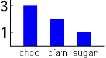
In bar graphs are usually used to display "categorical data", that is data that fits into categories. For example suppose that I offered to buy donuts for six people and three said they wanted chocolate covered, 2 said plain and one said with icing sugar. I would present this in a bar garph as:
Histograms on the other hand are usually used to present "continuous data", that is data that represents measured quantity where, at least in theory, the numbers can take on any value in a certain range. A good example is weight. If you measure the weights of a group of adults you might get and numbers between say 90 pounds and 240 pounds. We usually report our weights as pounds or to the nearest half pound but we might do so to the nearest tenth of a pound or however acurate the scale is. The data would then be collected into categories to present a histogram. For example:
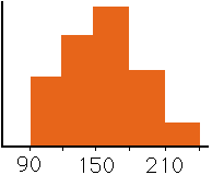
might be a histogram for heights (with the appropriate scale on the vertical axis). Here the data has been collected into categories of width 30 pounds.
The difference in the way that bar graphs and histograms are drawn is that the bars in bar graphs are usually separated where in histograms the bars are adjacent to each other. This is not always true however. Sometimes you see bar graphs with no spaces between the bars but histograms are never drawn with spaces between the bars.
- -1
Tinker Bell answered this
There are two differences, one is in the type of data that is presented and the other in the way they are drawn.
In bar graphs are usually used to display "categorical data", that is data that fits into categories. For example suppose that I offered to buy donuts for six people and three said they wanted chocolate covered, 2 said plain and one said with icing sugar. I would present this in a bar garph as:
Histograms on the other hand are usually used to present "continuous data", that is data that represents measured quantity where, at least in theory, the numbers can take on any value in a certain range. A good example is weight. If you measure the weights of a group of adults you might get and numbers between say 90 pounds and 240 pounds. We usually report our weights as pounds or to the nearest half pound but we might do so to the nearest tenth of a pound or however acurate the scale is. The data would then be collected into categories to present a histogram. For example:
The difference in the way that bar graphs and histograms are drawn is that the bars in bar graphs are usually separated where in histograms the bars are adjacent to each other. This is not always true however. Sometimes you see bar graphs with no spaces between the bars but histograms are never drawn with spaces between the bars.
- 0
Aman Koli answered this
Bar Graph
A bar graph, (or a bar chart, as it is sometimes referred to) is a way of showing a comparison of values. It is a chart wherein each bar is in proportion to the value that it represents. Bar graphs are used to help organize data and information. They also help show some patterns which are not readily seen when data is not organized in such way. This visual way of showing a comparison of variables is a great tool in making judgment and decisions.
Bar graphs show the frequency of the element in the set. They are visually depicted by the height of the bar representing the frequency of the element in the data set. The higher the frequency, the longer or taller the bar will be.
Bar graphs are often presented with the bars seperate from each other. This is usually to distinguish itself from another specific type of bar graph, the histogram. Actually, bar graphs can still be presented with the bars touching. It really doesn’t matter, unless you are very particular about differentiating them from your histogram presentations.
HISTOGRAM:
A histogram is a kind of bar graph, but rather more specific. Essentially, it is also a graphical display of values or frequencies. Unlike the ordinary bar graph, a histogram is used to show values of recorded data elements that are grouped or categorized.
In regards to the histogram, the data elements that are recorded and categorized, are usually numbers. Basically, these grouped elements are arranged in the visual data presentation to form an uninterrupted range of values from left to right. Having said that, the x-axis of the chart for the histogram is seen as a one long range of values. Thus, you can visually perceive the flow of frequency changes, and easily determine when patterns are evident.
The appearance of the histogram as a bar graph, is often depicted with the bars touching each other. This is to indicate that the items are non-discrete, unlike the items shown in a bar graph.
Summary:
1. A bar graph is a kind of visual representation of comparing values.
2. A histogram is a kind of bar graph that displays a more specific way of presenting comparisons.
3. The bar graph is often used to show a visual comparison of discrete elements, while the histogram is used to show the frequency of non-discrete, continuous items.
4. The items in the histogram are usually numbers, that are grouped or categorized in such a way that they are considered to be ranges. In regards to bar graphs, the elements or items are taken as separate entities.
5. Normally, a bar graph is drawn or depicted in a such a way, that a bar representing the frequency of an item, is not touching the bar of the next item. There is a visible space between the bars.
6. The bars in the histogram are always the touching the next one. There are no spaces in between.
- 1
Noddy answered this
1. A bar graph is a kind of visual representation of comparing values.
2. A histogram is a kind of bar graph that displays a more specific way of presenting comparisons.
3. The bar graph is often used to show a visual comparison of discrete elements, while the histogram is used to show the frequency of non-discrete, continuous items.
4. The items in the histogram are usually numbers, that are grouped or categorized in such a way that they are considered to be ranges. In regards to bar graphs, the elements or items are taken as separate entities.
5. Normally, a bar graph is drawn or depicted in a such a way, that a bar representing the frequency of an item, is not touching the bar of the next item. There is a visible space between the bars.
6. The bars in the histogram are always the touching the next one. There are no spaces in between.
- 0