
what is a pictograph?
what is a bargraph?
what is double bargraph?
what is organising data?
what is grouping data?
what is bar graph with a difference?
what is circle chart and pie chart?
what is tally?

Manmeet Singh answered this
To know about all these terms, please go through the chapter 5 once again.
- -3
Tejaswi answered this
hi!!!!!!!!!!!!!!!!!
A
Early written symbols were based on pictographs (pictures which resemble what they signify) and ideograms (symbols which represent ideas). Ancient Chinese, Sumerian, and Egyptian civilizations began to use such symbols over 5000 years ago, developing them into logographic writing systems around the third millennium BCE. Pictographs are still in use as the main medium of written communication in some non-literate cultures in Africa, The Americas, and Oceania. Pictographs are often used as simple, pictorial, representational symbols by most contemporary cultures.
Pictographs can often transcend languages in that they can communicate to speakers of a number of tongues and language families equally effectively, even if the languages and cultures are completely different. This is why road signs and similar pictographic material are often applied as global standards expected to be understood by nearly all.
Pictographs can also take the form of diagrams to represent statistical data by pictorial forms, and can be varied in color, size, or number to indicate change.
Pictographs can be considered an art form, and are designated as such in Pre-Columbian art, Native American art, and Painting in the Americas before Colonization. One example of many is the Rock art of the Chumash people, part of the Native American history of California. In 2011, UNESCO World Heritage adds to its list a new site "Petroglyphs Complexes of the Mongolian Altai, Mongolia"[2] to celebrate the importance of the pictograms engraved in rocks.
Some scientists in the field of neuropsychiatry and neuropsychology, such as Prof. Dr. Mario Christian Meyer, are studying the symbolic meaning of indigenous pictograms and petroglyphs,[3] aiming to create new ways of communication between native people and modern scientists to safeguard and valorize their cultural diversity.[4]
Modern use
Pictographs remain in common use today, serving as pictorial, representational signs, instructions, or statistical diagrams. Because of their graphical nature and fairly realistic style, they are widely used to indicate public toilets, or places such as airports and train stations.
A standard set of pictographs was defined in the international standard ISO 7001
Pictographic writing as a modernist poetic technique is credited to Ezra Pound, though French surrealists accurately credit the Pacific Northwest American Indians of Alaska who introduced writing, via totem poles, to North America.[5]
Contemporary artist Xu Bing created Book from the Ground, a universal language made up of pictograms collected from around the world. A Book from the Ground chat program has been exhibited in museums and galleries internationally. There is a Book from the Ground Wiki currently in development that needs public participation in development. The wiki will be a continually growing database of pictogram used in the chat program
2)A Bar Graph (also called Bar Chart) is a graphical display of data using bars of different heights.
3)A double bar graph is a bar graph with two bars that compare two sets of data. Don't get too overwhelmed by the name. They really are simple to figure out when you look at them.
i wish these three answers will hlp u THANK YOU
- 1
Shagun Swt Angel answered this
1. Pictographs are graphs that use symbols to represent data sets and numerical information. Many people think that pictographs make information much easier to read. The disadvantage of pictographs is that it can only communicate small amounts of specific information.
2. A Bar Graph (also called Bar Chart) is a graphical display of data using bars of different heights.
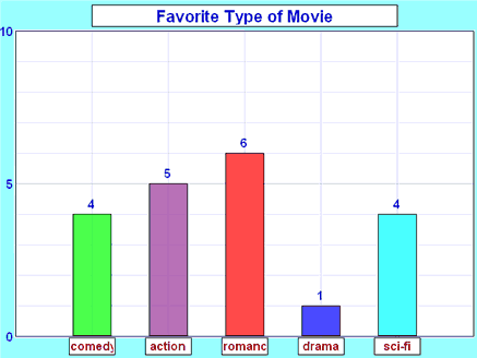
Imagine you just did a survey of your friends to find which kind of movie they liked best.
Here are the results:
| Table: Favorite Type of Movie | ||||
| Comedy | Action | Romance | Drama | SciFi |
|---|---|---|---|---|
| 4 | 5 | 6 | 1 | 4 |
You could show that on a bar graph like this:
3. A double bar graph is a bar graph with two bars that compare two sets of data. Don't get too overwhelmed by the name. They really are simple to figure out when you look at them.
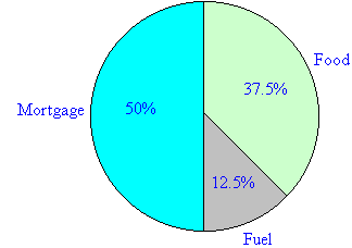
4. Pie charts are useful to compare different parts of a whole amount. They are often used to present financial information. E.g. A company's expenditure can be shown to be the sum of its parts including different expense categories such as salaries, borrowing interest, taxation and general running costs (i.e. rent, electricity, heating etc).
A pie chart is a circular chart in which the circle is divided into sectors. Each sector visually represents an item in a data set to match the amount of the item as a percentage or fraction of the total data set.
Example
A family's weekly expenditure on its house mortgage, food and fuel is as follows:
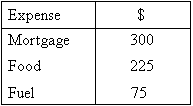
Draw a pie chart to display the information.
Solution:
![]()
We can find what percentage of the total expenditure each item equals.
Percentage of weekly expenditure on:
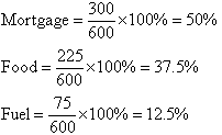
To draw a pie chart, divide the circle into 100 percentage parts. Then allocate the number of percentage parts required for each item.
Tally is a financial accounting software package designed by Tally Solutions mainly for small businesses and shops. They claim on their website that Tally is used by over 2 million users, in over 90 countries. Tally 9.0 is the latest version to date. You can see more details on their website.
Tally is a complete business accounting and inventory management software that provides various facilities like Govt. supported formats, multilingual operations, online functions and processing for small and medium businesses.
- 1